
Build a Dashboard
Microsoft Power BI is a powerful tool for visualizing large amounts of data in a clear and useful way. When used in combination with a Teneo project, visualizations can be created to illustrate information about a bot's performance and the conversations that end users are having with that bot. Visualizations can be combined into interactive and customizable dashboards. In order to demonstrate how Power BI might benefit your Teneo project, we have created three different dashboard concepts that you can apply to your own solution:
Getting started
There are a few simple steps that need to be taken in order to set up the dashboards:
- These dashboards are created using shared queries, which access the log data generated by your published solution. To set up dashboards of your own, you must have a published solution with log data and shared queries that access that log data.
- You can find the queries you will need for these dashboards in the Queries section. These queries must be shared and published. You can read more on how to set up your shared queries here.
- You can find the Power BI connector and other information in the Download section.
The rest of this page will give you more information on what these different dashboard levels are and how to set them up for your project. We will refer to the queries by name throughout, so make sure to share and publish the full list of queries in your solution before getting started.
Overview dashboard
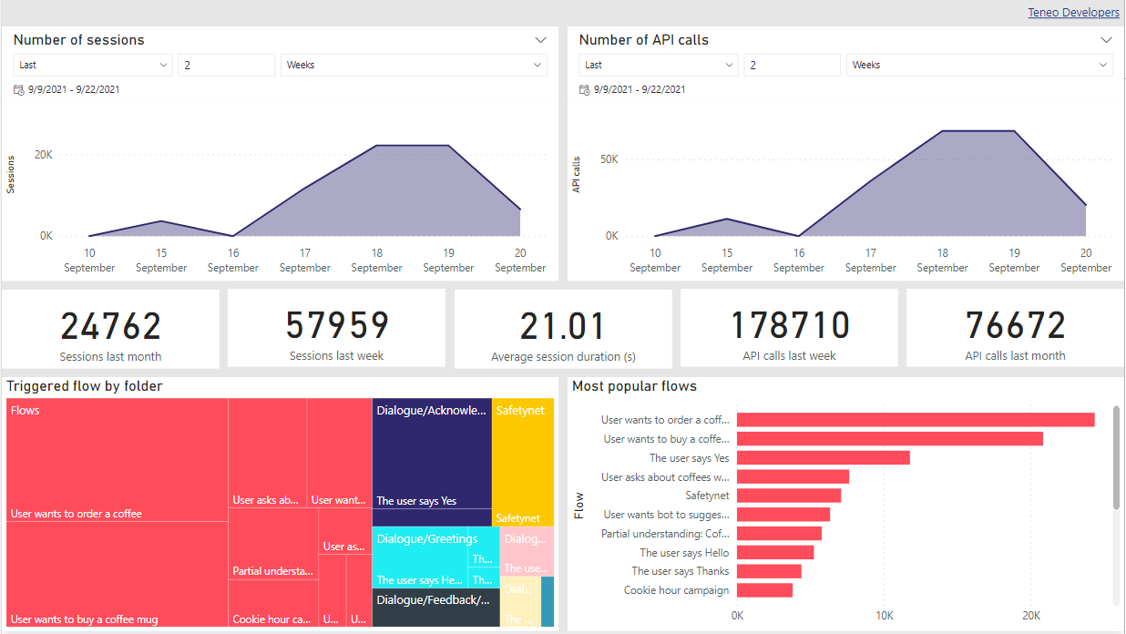
The Overview dashboard is designed to give you a general idea of how your bot is performing and how end users are interacting with it. It includes metrics on number of sessions and API calls on specific days, number of user inputs, triggered flows, and more.
This is what the Overview dashboard looks like in Power BI:
Visualization breakdown
Here, we will go through what each visualisation in the Overview dashboard represents and how it was created.
Number of sessions & Number of API calls
These visualizations can be used to compare the numbers of sessions and API calls on different days. Each chart has a relative date selector, known as a slicer within Power BI, that can be used to select a certain time range in days, weeks, months, etc. The slicers affect only these two charts.
In Inquire, the data required for these visuals are accessed using the query List_API_calls_per_session.
The data table is then modified in Power BI to be grouped by the beginning time to count the number of sessions or transactions per day. The graph visualizations are Area charts using the end time as the time dimension in the X axes. The count of session IDs and number of transactions are used for the Y axes. The slicers placed above them are based on the time element in the same query.
Statistics
These statistics, found in the middle row of the dashboard, present five different numbers:
- Sessions past month and Sessions past week: this is the total number of sessions in the past week or month, relative to the current date. A filter is applied to the data in Power BI to set the desired time frame.
- Average session duration (s): this is the average duration of all past sessions. This data are calculated in Power BI based on the difference between the beginning and end time of each session.
- API calls past month and API calls past week: this is the total number of API calls in the past week or month, relative to the current date. A filter is applied to the data in Power BI to set the desired time frame.
All of these statistics are found using the query List_API_calls_per_session.
Triggered flow by folder
This treemap can be used to see which folders the most frequently triggered flows are located in.
In Inquire, the data are accessed using the query Triggered_flows.
The size of the box containing the flow's name corresponds with how many times that flow was triggered, and color-coding is used to visualize different folders. A tooltip shows the folder, full flow name, and the number of sessions that triggered that flow.
Most popular flows
This visualization is useful for reviewing which flows are triggered the most when end users interact with a bot.
In Inquire, the data are accessed using the query Triggered_flows.
This Clustered bar chart simply counts the number of sessions that triggered each flow.
Specialized dashboard
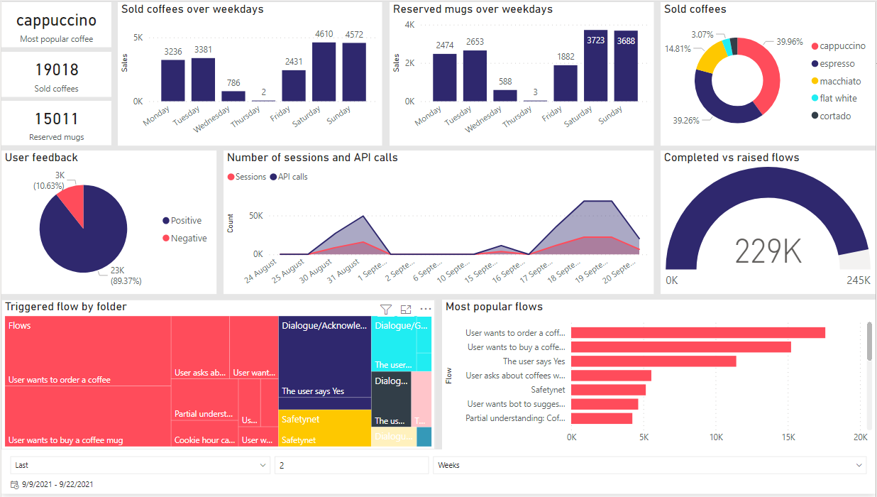
The pre-built Specialized dashboard template comes with several useful solution-specific visualizations. In order to showcase these, we have incorporated the current Longberry Baristas use case as an example.
The Longberry Baristas solution is included when registering for a environment at Teneo Developers. This dashboard is applicable to Longberry Baristas data, and with a few extra steps it can also be applied to other solutions. It can also serve as a template to give some inspiration on how to go about creating dashboard visuals that are more specialized to a certain project.
This is what the Specialized dashboard looks like in Power BI:
Visualization breakdown
Here, we will go through what each visualisation in the Specialized dashboard represents and how it was created.
Business Use Cases
The main goal of the Longberry Baristas solution is to create revenue for a local barista coffeeshop. In this solution three targets are considered valuable:
- Most popular coffee type
- Coffees sold
- Reserved mugs
This data are logged by Metadata tags inside the solution. A guide on how to use Metadata can be found here.
In Inquire, the data are accessed using the following queries:
- Most popular coffee type and Coffees sold use the query Sold_coffees_per_weekday
- Reserved mugs uses the query Reserved_mugs_per_weekday.
The Sold_coffees_per_weekday query is duplicated and modified inside Power BI to get the number of sold coffees for each coffee type.
Sold coffees over weekdays & Sold coffee mugs over weekdays
These charts reveal how many coffees or mugs are sold on different weekdays.
In Inquire, the data are accessed using the following queries:
- Sold coffees uses the query Sold_coffees_per_weekday
- Sold mugs uses the query Reserved_mugs_per_weekday.
Sold coffees
This donut chart shows how many times each of the available coffee types have been sold.
In Inquire, the data are accessed using the query Sold_coffees_per_weekday
The Sold_coffees_per_weekday query is duplicated and modified inside Power BI to get the number of sold coffees for each coffee type.
User feedback
This pie chart displays the percentages of positive vs negative feedback received from end users. Feedback is logged using Metadata tags inside the Longberry Baristas solution after the bot asks the user if their question has been answered at the end of a flow. A guide on how to use Metadata can be found here.
In Inquire, the data are accessed using this query User_feedback.
The visualization uses the count of each feedback type as the displayed data value, while the feedback type itself (positive or negative) is used for the legend.
Number of sessions and API calls
This visualization is the same as the Number of sessions and Number of API calls visualizations in the Overview dashboard, but combined into one chart.
Completed vs raised flows
To calculate the health of the solution for this example, we counted the number of completed flows and, with this visualization, displayed how many there were in relation to all raised flows. These queries make use of Augmenters.
In Inquire, the data are accessed using the following queries:
- Number of completed flows uses the query Completed_flows.
- Number of raised flows uses the query Raised_flows.
This Gauge chart takes the number of completed flows as its value and the number of raised flows as its maximum value; in other words, it shows how many of all raised flows have been completed.
Triggered flow by folder
This visualization is the same as the one found in the Overview dashboard.
Most popular flows
This visualization is the same as the one found in the Overview dashboard.
Slicer
The relative date selector, known as a slicer in Power BI, at the bottom of the page affects the visualizations Triggered flow by folder and Most popular flows. It uses the time element from List_API_calls_per_session.
Queries
The following is the complete list of TQL queries required to set up the Overview and Specialized dashboards.
- Completed_flows
tql
1ca t.e.fname 'n:Completed flow' : t.e.pathType == 'drop-flow', t.e.aborted == false, t.e.stuck == false
2- List_API_calls_per_session
tql
1la s.id 's:Session id', s.beginTime 'dt:Begin time', s.endTime 'dt:End time', s.transactionCount 'n:Transaction count'
2- Raised_flows
tql
1ca t.e.fname 'n:Raised flow' : t.e.pathType == 'raise-flow'
2- Reserved_mugs_per_weekday
tql
1la beginDate 's:Begin date', orderDate 's:Order', t.e.md:MugReserved 's:MugReserved' : catd(pattern="EEEE") s.beginTime beginDate, t.e.md:MugReserved ~='.*(true)', catd(pattern="ee") s.beginTime orderDate s:Order
2- Sold_coffees_per_weekday
tql
1la beginDate 's:Begin date', orderDate 's:Order', t.e.md:CoffeeType 's:Coffee type' : catd(pattern="EEEE") s.beginTime beginDate, t.e.md:CoffeeType ~= ".(\w.).+", catd(pattern="ee") s.beginTime orderDate s:Order
2- Triggered_flows
tql
1la s.id 's:Session id', t.time 'dt:Time', t.e.fname 's:Flow', t.e.folder 's:Folder' : t.e.pathType == 'flow-trigger'
2- User_feedback
tql
1la t.e.md:UserFeedback 's:User Feedback' : t.e.md:UserFeedback == in {'Positive', 'Negative'}
2Download
- Request access to Teneo Developers to get access to Longberry Baristas here.
- Download the Power BI connector from GitHub: Production Setup or Development Setup.
- To see the dashboards with our data, please download the pre-built dashboards here.